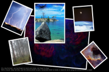
Qt Quick Demo - Photo Surface
A QML app for touch devices that uses a Repeater with a FolderListModel to access content in a folder, and a PinchArea that contains a MouseArea to handle pinch gestures on the fetched content.

Photo Surface demonstrates how to use a Repeater with a FolderListModel and a FolderDialog to access images from a folder selected by a user and how to handle dragging, rotation and pinch zooming within the same item using a PinchArea that contains a MouseArea.
All the app code is contained in one QML file, photosurface.qml. Inline JavaScript code is used to place, rotate, and scale images on the photo surface.
Running the Example
To run the example from Qt Creator, open the Welcome mode and select the example from Examples. For more information, visit Building and Running an Example.
Creating the Main Window
To create the main window for the Photo Surface app, we use the Window QML type as the root item. It automatically sets up the window for use with Qt Quick graphical types:
 Window {
     id: root
     visible: true
     width: 1024; height: 600
     color: "black"
     property int highestZ: 0
     property real defaultSize: 200
     property var currentFrame: undefined
To use the Window type, we must import it:
import QtQuick.Window
Accessing Folder Contents
We use a Repeater QML type together with the FolderListModel to display GIF, JPG, and PNG images located in a folder:
         Repeater {
             model: FolderListModel {
                 id: folderModel
                 objectName: "folderModel"
                 showDirs: false
                 nameFilters: imageNameFilters
             }
To use the FolderListModel type, we must import it:
import Qt.labs.folderlistmodel
We use a FolderDialog to enable users to select the folder that contains the images:
     FolderDialog {
         id: folderDialog
         title: "Choose a folder with some images"
         folder: picturesLocation
         onAccepted: folderModel.folder = folder + "/"
     }
To use the FolderDialog type, we add the following import statement:
import Qt.labs.platform
We use the folderDialog.open() function to open the file dialog when the app starts:
Component.onCompleted: folderDialog.open()
Users can also click the folder dialog icon to open it. We use an Image QML type to display the icon. Inside the Image type, we use a MouseArea with the onClicked signal handler to call the folderDialog.open() function:
     Image {
         anchors.top: parent.top
         anchors.left: parent.left
         anchors.margins: 10
         source: "resources/folder.png"
         MouseArea {
             anchors.fill: parent
             anchors.margins: -10
             onClicked: folderDialog.open()
             hoverEnabled: true
             onPositionChanged: {
                 tooltip.visible = false
                 hoverTimer.start()
             }
             onExited: {
                 tooltip.visible = false
                 hoverTimer.stop()
             }
Displaying Images on the Photo Surface
We use a Rectangle as a delegate for a Repeater to provide a frame for each image that the FolderListModel finds in the selected folder. We use JavaScript Math() methods to place the frames randomly on the photo surface and to rotate them at random angles, as well as to scale the images:
             Rectangle {
                 id: photoFrame
                 width: image.width * (1 + 0.10 * image.height / image.width)
                 height: image.height * 1.10
                 scale: defaultSize / Math.max(image.sourceSize.width, image.sourceSize.height)
                 Behavior on scale { NumberAnimation { duration: 200 } }
                 Behavior on x { NumberAnimation { duration: 200 } }
                 Behavior on y { NumberAnimation { duration: 200 } }
                 border.color: "black"
                 border.width: 2
                 smooth: true
                 antialiasing: true
                 Component.onCompleted: {
                     x = Math.random() * root.width - width / 2
                     y = Math.random() * root.height - height / 2
                     rotation = Math.random() * 13 - 6
                 }
Handling Pinch Gestures
We use a PinchArea that contains a MouseArea in the photo frames to handle dragging, rotation and pinch zooming of the frame:
                 PinchArea {
                     anchors.fill: parent
                     pinch.target: photoFrame
                     pinch.minimumRotation: -360
                     pinch.maximumRotation: 360
                     pinch.minimumScale: 0.1
                     pinch.maximumScale: 10
                     pinch.dragAxis: Pinch.XAndYAxis
                     onPinchStarted: setFrameColor();
We use the pinch group property to control how the photo frames react to pinch gestures. The pinch.target sets photoFrame as the item to manipulate. The rotation properties specify that the frames can be rotated at all angles and the scale properties specify that they can be scaled between 0.1 and 10.
In the MouseArea's onPressed signal handler, we raise the selected photo frame to the top by increasing the value of its z property. The root item stores the z value of the top-most frame. The border color of the photo frame is controlled in the onEntered signal handler to highlight the selected image:
                     MouseArea {
                         id: dragArea
                         hoverEnabled: true
                         anchors.fill: parent
                         drag.target: photoFrame
                         scrollGestureEnabled: false  // 2-finger-flick gesture should pass through to the Flickable
                         onPressed: {
                             photoFrame.z = ++root.highestZ;
                             parent.setFrameColor();
                         }
                         onEntered: parent.setFrameColor();
To enable you to test the example on the desktop, we use the MouseArea's onWheel signal handler to simulate pinch gestures by using a mouse:
                         onWheel: {
                             if (wheel.modifiers & Qt.ControlModifier) {
                                 photoFrame.rotation += wheel.angleDelta.y / 120 * 5;
                                 if (Math.abs(photoFrame.rotation) < 4)
                                     photoFrame.rotation = 0;
                             } else {
                                 photoFrame.rotation += wheel.angleDelta.x / 120;
                                 if (Math.abs(photoFrame.rotation) < 0.6)
                                     photoFrame.rotation = 0;
                                 var scaleBefore = photoFrame.scale;
                                 photoFrame.scale += photoFrame.scale * wheel.angleDelta.y / 120 / 10;
                             }
                         }
The onWheel signal handler is called in response to mouse wheel gestures. Use the vertical wheel to zoom and Ctrl and the vertical wheel to rotate frames. If the mouse has a horizontal wheel, use it to rotate frames.
Files:
- demos/photosurface/CMakeLists.txt
- demos/photosurface/main.cpp
- demos/photosurface/photosurface.pro
- demos/photosurface/photosurface.qml
- demos/photosurface/photosurface.qmlproject
- demos/photosurface/photosurface.qrc
Images:
See also QML Applications.